Levels
Navigation candidates
Global, local and contextual routes
By UXbeam · Information architecture tools since 2021 · Published September 27, 2026
A sitemap gives you structure, not a finished interface. Moving from a sitemap to low-fidelity wireframes means using evidence from card sorting, tree testing or other IA research to choose navigation, screens and layouts, then test the task intent.
1 A branch becomes navigation.
2 A node becomes a screen.
3 Task evidence informs placement.
4 An action becomes a control.
At UXbeam, we use four lenses to carry evidence-led IA into interface design: levels, nodes, siblings, and research evidence. Evidence can influence every later decision, from navigation to placement.
Global, local and contextual routes
Decide what needs a destination and what belongs within one
Arrange items for recognition, comparison or browsing
Try a placement, preserve its rationale, then test
Record what participants did before interpreting why. Bring groupings and labels from card sorting, paths and outcomes from tree testing, or findings from other IA research. Tie every proposed change to the observation it is meant to address.
ObservationThe task path ends in Messages.
InterpretationThat path suggests response information belongs closer to the conversation.
Candidate moveTry response information in Messages and on the listing.
ObservationChoices split between saved searches and notification settings.
InterpretationParticipants may treat the saved search and its notification settings as two entry points to the same task.
Candidate moveTest whether one route should cross-link to the other.
ObservationThe task path ends at the listing description.
InterpretationRequirements may be expected alongside the home being considered.
Candidate moveTry a requirements section on the listing.
For tree-testing evidence, keep the original task wording, valid destinations, direct / indirect results, paths, and denominator with the evidence sheet.
What does this node represent? Use its type to narrow candidate layouts, then choose using the task and the content.
Use these node types as a practical way to narrow layout options. Types can overlap; empty states are handled separately because they describe a condition of a view.
A place whose main job is routing people to related destinations.
Are the destinations peers, or does one task need more prominence?
A parent node can be a hub without becoming a separate landing screen.
Works well when distinct destinations need a clear starting point.
Works well when one starting task deserves emphasis while other destinations remain accessible.
Task context · content relationships · available width · interaction needs
A set of comparable items people browse, scan, search, or filter.
Do people recognize items visually, or compare their attributes?
Filtering favors a catalog or list. Exploratory feeds may suit progressive loading.
Works well when visual recognition helps someone choose an item.
Works well when constraints help narrow a collection before comparing attributes.
Comparison needs · visual recognition · attributes · collection size
One thing with attributes and related objects, such as a rental listing.
What must be read together? Which related objects should be reachable here?
An object can appear in several contexts. Use tabs when sections are meaningfully distinct, not simply because the page is long.
Works well when related information needs to be read together.
Works well when distinct sections can be visited separately.
Task context · content relationships · available width · interaction needs
An activity with steps, decisions or dependencies.
Must these steps happen in order? Can someone pause or revisit them?
A verb label does not make something a process; the task needs steps, decisions, or dependencies.
Works well when dependencies make an ordered sequence useful.
Works well when the required inputs can be understood in one view.
Task context · content relationships · available width · interaction needs
A location or area whose spatial relationships matter to the task.
Does seeing proximity help people decide, or is an address enough?
A map can accompany a list; location data does not require a map-only interface.
Works well when proximity or spatial relationships affect the choice.
Works well when attributes need to be scanned across items.
Task context · content relationships · available width · interaction needs
An exchange of messages and its surrounding context.
Does the reader need to compare threads, or focus on one exchange?
Use conversation patterns when the exchange itself is the task; otherwise treat support as content or a workflow.
Works well when the exchange is the main task.
Works well when detail and a choice of items need to stay in view.
Task context · content relationships · available width · interaction needs
A working area or a set of controls for a product or object.
Which views must stay visible together? Which settings belong to one object?
Workspaces often keep several working views visible; settings usually group controls around one object or account.
Works well when persistent access to sections supports the task.
Works well when several working views need to remain visible together.
Task context · content relationships · available width · interaction needs
Something a person can do in a particular context: add, share or contact.
Where is the action relevant, and what information is needed before taking it?
Consider an inline control, toolbar or persistent action. Use a modal for a bounded interaction, not as a substitute for navigation.
Works well when the next action belongs to the current object.
Works well when the required inputs can be understood in one view.
Task context · content relationships · available width · interaction needs
An ordered sequence of events, updates or activity.
Do dates and sequence help the task? Must people find an older entry again?
Choose pagination or progressive loading when retrieval and returning to position matter.
Works well when sequence and timing help explain events.
Works well when events need to be scanned by date and older entries retrieved.
Task context · content relationships · available width · interaction needs
Two or more items examined against the same attributes.
Which attributes need alignment, and how much fits in the viewport?
Preserve the same attribute order when a small screen cannot show items side by side.
Works well when the same attributes need direct comparison.
Works well on narrow screens when each item repeats the same attributes in the same order.
Task context · content relationships · available width · interaction needs
Sophia Prater’s ORCA process contributes the object, relationship, CTA, and attribute lens. The node taxonomy above is UXbeam’s working framework for translating IA into interface patterns.
The tree narrows the field to navigation patterns worth exploring. Platform, viewport, task focus and switching behavior determine which ones to prototype.
NN/g covers navigation trade-offs; Apple and Material document platform-specific tab and rail behavior. The shortlist above combines those constraints with the shape of the IA.
A Page Description Diagram makes content priority explicit before layout. Tasks, research and stakeholder judgment inform the order.
Priority is a design decision. Task tags keep each placement tied to the evidence behind it.
Dan Brown’s approach is described in Butler and Wirtanen’s introduction to PDDs.
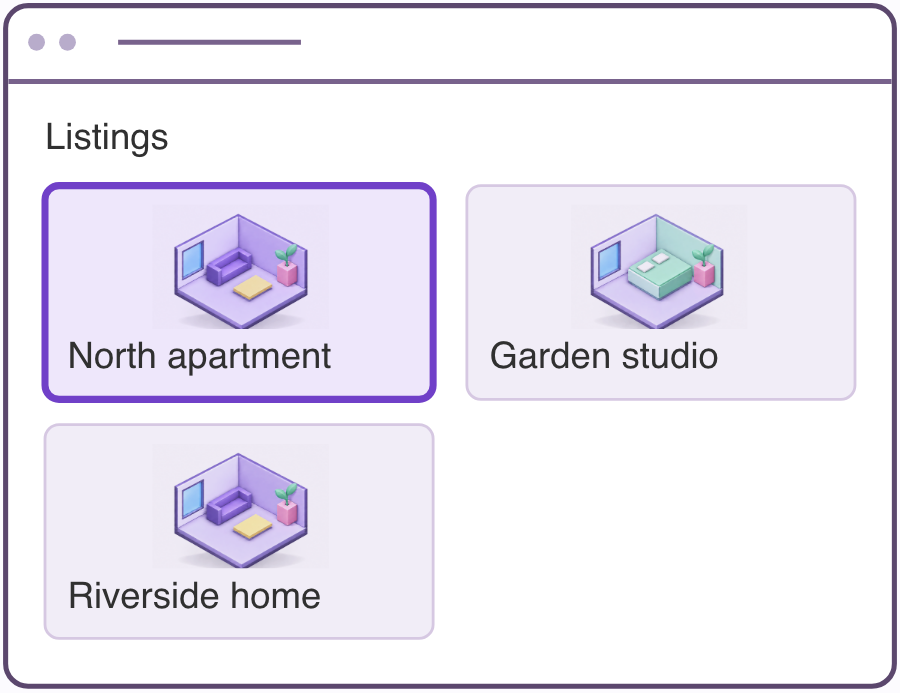
The same three listings can support different ways of choosing a home. Use a working task intent to compare arrangements before committing to one.
Works well when appearance helps someone recognize a suitable home.
Works well when rent and size need to be scanned and compared.
Works well when someone needs listing detail while keeping the alternatives in view.
Same IA ≠ one inevitable UI
UI layout catalogues are useful for naming patterns; the task and content determine which ones are worth testing.
Build a low-fidelity, grey-box wireframe using only the frames needed for the task. Keep each design change tied to the observation it addresses.
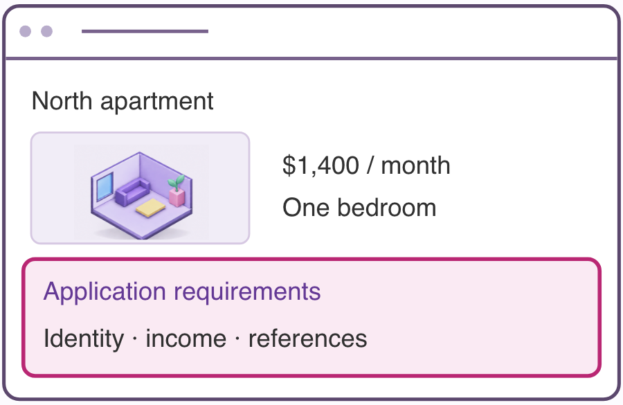
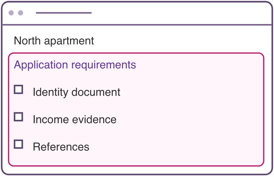
RESEARCH OBSERVATIONIn this example, the path ends at the listing description.
CANDIDATE INTERVENTIONTry requirements within the listing and retest whether they can be found.
Turn the working task intent into a testable task. If the structure was already tree-tested, preserve the information or action sought. If it came from card sorting or another IA process, write a neutral task around the need you used to compare layouts. Then define the outcome and test whether the wireframe supports it.
In this example, the path ends at the listing description.
The candidate wireframe places the information within the listing.
Observe the first choice, completed path and any new difficulty caused by the layout.
Keep tree-test directness, first-click accuracy, and task completion as separate measures. Compare them quantitatively only when the outcome definitions and study designs match.
Record the result, denominator and exclusions for each study. Investigate new problems before deciding whether labels, placement or interaction need another change.
Use the result to frame a question. The design response remains a hypothesis to explore.
Does the grouping support an important task? Does it need global access?
Consider a destination, section or local grouping; test its prominence.
Is the pattern meaningful, a wording or method artifact, or an opportunity for differentiation?
Inspect the pattern first. It may justify alternate access, a candidate IA, further ideation, or no change.
Is the label ambiguous? Do the different placements support different tasks?
Inspect the card wording and the groups around it. Consider clearer wording, a cross-link or an alternate home.
Where do the detours begin? Which first choices attract participants?
Try clearer labels, a different grouping or more visible sub-items.
What could participants reasonably expect there? Are destination criteria clear?
Check why participants expected the content there; then consider a preview, cross-link, or label change.
In which context is the task frequent? How much persistent space does it warrant?
Consider a shortcut, persistent control or navigation destination where it helps.
Mental Model Detection identifies recurring ways participants organized the cards. Inspect the organizing principles, labels, and contents before deciding what to do with a secondary mental model. It may support alternate access, ideation, a candidate sitemap, or no change.
This guide is UXbeam’s synthesis of the decisions involved in carrying evidence-led IA into interface design. PDDs, OOUX / ORCA, and platform guidance contribute specific techniques referenced where they are used.