Tree testing case study
Yoga App Navigation: A Tree Testing Case Study
By UXbeam, information architecture tools and services since 2021 · September 9, 2026
Both candidate navigations scored 74% overall. But in one, participants went straight to the destination on 5 of 6 tasks instead of 2 of 6.
The app concept combined yoga classes, guided meditation, breathing exercises, workout challenges, personalized plans, progress tracking, reminders, wearable integrations, a community area, and sharing to YouTube and Instagram. The feature set came from a UXbeam scan of yoga apps including Daily Yoga, Down Dog and Yoga-Go. Classes, personalized practice, progress tracking and breathing exercises recur across the category. The question was how those features should be organized so people could find them.
Two candidate structures, version one (V1) and version two (V2), were built as clickable navigation outlines and tested with separate participant groups on closely matched sets of six tasks. V2 put several actions closer to the top and used fewer, plainer labels.
Six tasks across the journey
Together, the six tasks cover different stages of using a yoga app, from finding a practice and personalizing guidance to tracking progress, contributing routines, and setting up sharing.
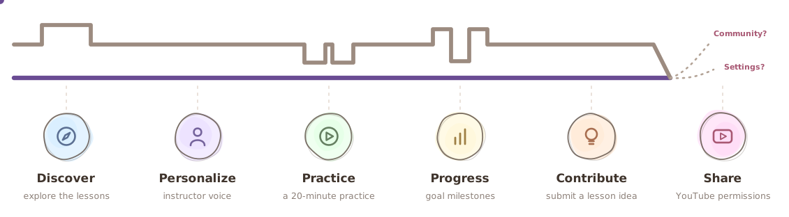
| Journey stage | V1 | V2 |
|---|---|---|
| Explore the lessons | Many detours | Mostly direct |
| Change instructor voice | Mostly direct | Mostly direct |
| Find a 20-minute practice | Mixed paths | Mostly direct |
| Find goal-based milestones | Correct section, confusing choices | Mostly direct* |
| Submit a lesson idea | Mostly direct | Mostly direct |
| YouTube permissions | Split between Community and Settings | Still split |
*The task instruction and destination changed between versions, so this row is not a clean before/after comparison.
On exploring the lessons: in both versions, most participants eventually reached the class library. In V1, more than half took a detour first. In V2, most went directly.
On goal milestones: in V1, most participants entered Goals & plans immediately, then split across several similar labels inside it. The top-level section was not the problem. The labels underneath it were.
The overall success rate stayed at 74%, but direct tasks increased from 33% in V1 to 83% in V2, from 2 of 6 tasks to 5 of 6.
Before testing the navigation, the test itself needed fixing
The first draft of this study had seven tasks, and some task instructions tried to test several intentions at once. One broad task about managing your online account could count six different destinations as correct. If six different destinations can all count as correct, it becomes difficult to tell what the navigation result means.
So before any participants were recruited, the tasks were rewritten into six single-purpose instructions, overlapping labels were renamed, and some navigation paths were simplified. For example, Search by criteria became Filter by criteria, and Settings became App Settings. Ten iterations were pretested in UXbeam during a single 90-minute session, just before participant recruitment. The two final candidates were then tested with separate participant groups.
Three lessons from the tasks
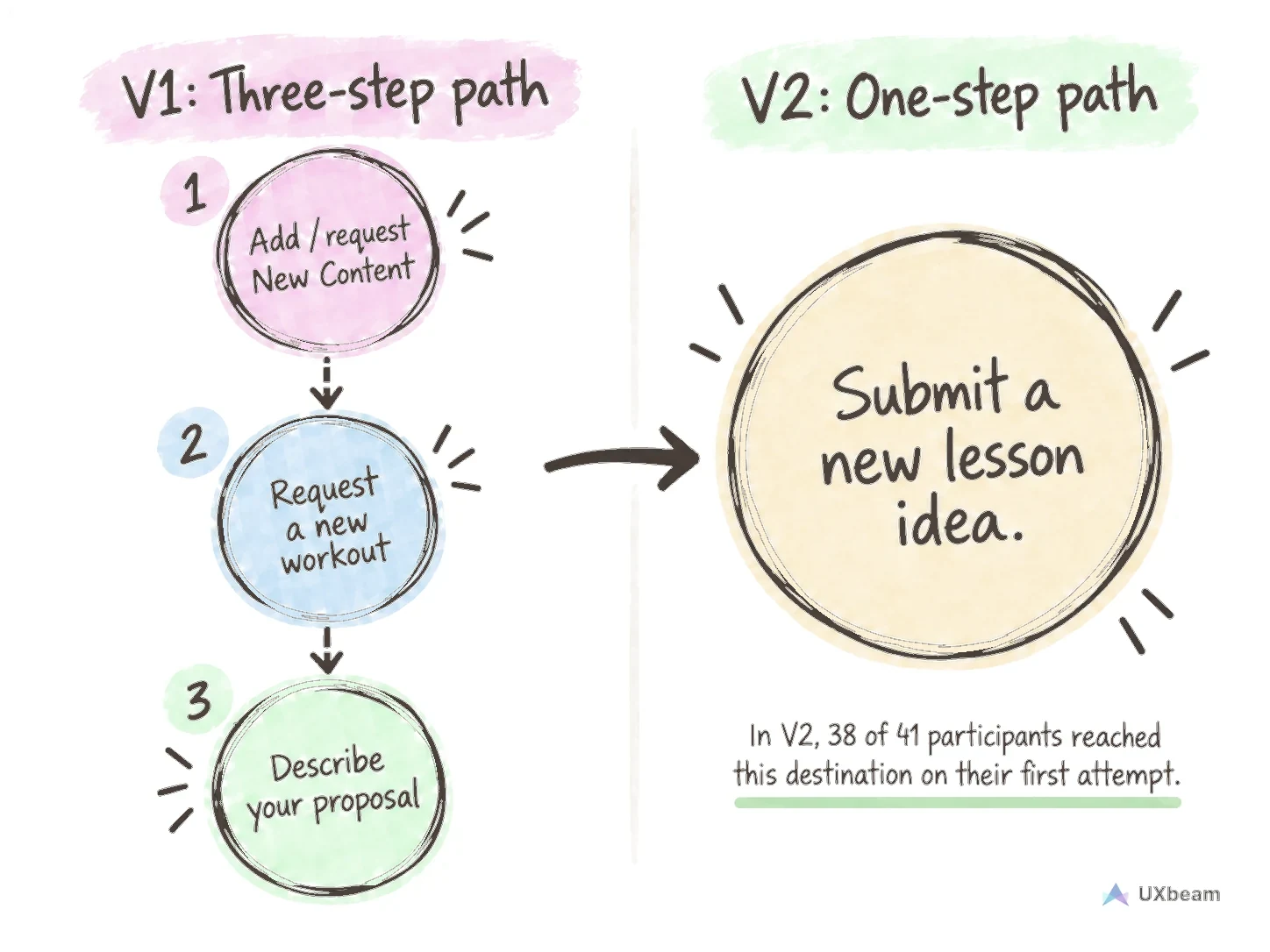
Contribute: a shorter path was easier to find. In V1, submitting a routine took three steps. V2 replaced that path with one plainly named destination, reachable from both the Practice and Community sections. Success rose from 86% to 92%, and directness rose from 62% to 73%.
Practice: a more visible option became a new competing choice. Success on finding a practice under 20 minutes barely moved between versions, 62% and then 63%. Moving Quick Workouts higher made it a plausible destination for the 20-minutes task. Six participants chose it instead of the session-duration filter. Making one option easier to see can create a new competing choice.
Share: renaming did not resolve a placement conflict. Asked to give the app permission to post videos to YouTube, participants split almost evenly between the Community section and App Settings. The split appeared in V1 and persisted in V2 after the labels were reworded, and success on this task fell from 85% to 57%, with many wrong paths ending on User profiles inside Settings. The recommendation was to keep YouTube permissions in App Settings as their canonical home and make the same setting reachable from the Community sharing flow.
Next steps before wireframing
This tree testing study specified a V2 information architecture that reduced detours across most of the tested journey. Two open items remained: Quick Workouts still competes with the session-duration filter, and YouTube permissions still split expectations between Community and App Settings.
The next step was to wireframe the sharing flow around that recommendation and test it as a prototype.
Method
- Participants: V1: 32 participants included in the results. V2: 43. Separate participant groups tested each version.
- Tasks: six per version. Four were identical, one gained a second valid destination, and one changed wording and destination.
- Scoring: success means reaching a valid destination. A direct task means participants mostly reached it without backing out of the section.
- Completed all 6 tasks: 6/32 vs 12/43.
The six task instructions (V1; two were adjusted in V2)
- You want to explore the different lessons available for yoga lovers
- You want to change the gender of your instructor's voice
- You are looking at milestones and suggestions tailored at the objectives you provided
- You are looking for lessons that would take 20 minutes of your time max
- You have a creative workout idea for instructors looking to create new content
- You want to give permissions to post your own videos to Youtube
Sources
- Daily Yoga, dailyyoga.com.
- Down Dog, downdogapp.com.
- Yoga-Go, yoga-go.io.