Mobile Payment App


Tree testing example

Mobile payment apps (Apple Pay, Google Pay, Venmo, PayPal, Samsung Pay, Zelle Pay, Circle Pay, Cash app, Venmo) Mobile payment apps (Apple Pay, Google Pay, Venmo, PayPal, Samsung Pay, Zelle Pay, Circle Pay, Cash app, Venmo)

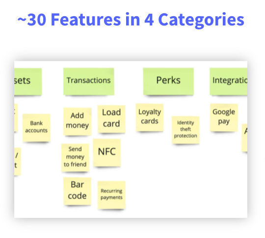
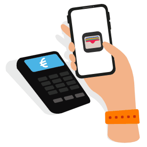
A majority of consumers see mobile apps as a convenient and secure way to make purchases, send money and other transactions such as recurring, in-store and person-to-person payments.

A number of apps explore these services in conjunction with perks like rewards programs, fraud protection, boarding passes and NFC (contactless) transactions.

In this tree testing example, discover how to:

  • gather the must-have features for such apps, 
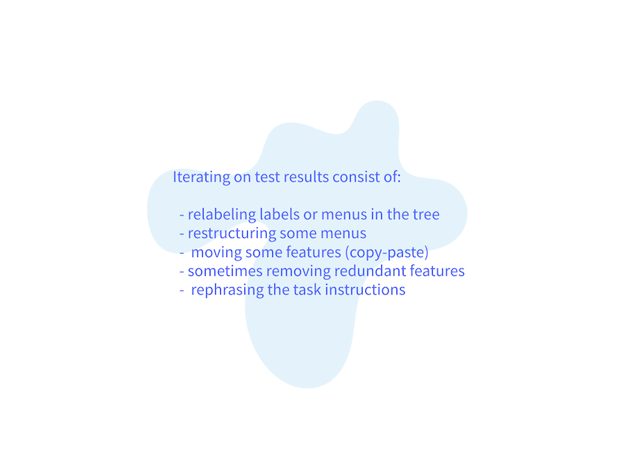
  •  optimize an information architecture through unmoderated, iterative tree testing
  • ensure first-time users find their way in a mobile payment app

Tree File preparation

The Information Architecture process for this case study started with an inventory of features offered by 3 competitor apps (Mastercard's Cash Passport, Pyypl, and Cards )

  • Competitive analysis of 3 mobile pay apps
    Competitive analysis
  • Card sorting of Mobile payment features in Miro
    Card sorting of features (Miro)
  • Tree Testing example for a Mobile Payment app
    Tree outline

We then discussed feature groupings during a card sorting workshop in Miro.
The resulting tree was formatted using a 2-space indentation and uploaded to UXbeam for testing.

Test setup

Results and Analysis

The initial rounds of testing revealed an INDIRECT outcome for 4 out of the 6 tasks.
We thus needed to iterate on the tree and instructions -which took 8 rounds to optimize.

Click to view the progress between iterations (rounds of testing) 👇

  • Tree Test analysis Mobile payment app - iteration #2
  • Tree Test analysis Mobile payment app - iteration #6
  • Tree Test analysis Mobile payment app - iteration #8
  • Iterating

Impact

✅. Discovered unexpected feature groupings ✅ Refined labels ✅ Clarified the task scenario

Next Steps


Qualitative testing

Once 80% of tasks are Direct, the prototype can be shared with a few participants in a moderated setup, with the same tasks but this time asking for qualitative feedback (what liked/disliked, what is missing, when would you see yourself using this the most, etc.).

Wireframing
Wireframe icon

In parallel, parsing the tree into meaningful screens and navigation by making sure the labeling conventions are respected and alternative navigations can be concept tested

Validate your product's information architecture for free

Check out what UXbeam has to offer and get early access