Card sorting + tree testing case study
Designing a Connected Car App: Card Sort + Tree Test
By UXbeam, information architecture tools and services since 2021 · Updated September 27, 2026
Connected car apps typically organize automotive features by vehicle system, such as climate, security, access, charging and maintenance. An open card sort surfaced another organization based on proximity to the car.
UXbeam turned both into candidate navigation structures and tested them with the same eight tree testing tasks on separate participant groups. The proximity structure reached 70.1% task success versus 60.4% for the OEM-style structure. The 9.7-point overall edge came from much larger task-level wins and losses in both directions, which the study breaks down below.
Connected car apps: most owners have one, few reach for it
Almost every new car above a base trim ships with a companion app. The J.D. Power 2025 U.S. OEM ICE App Report finds that nearly 80% of owners use their vehicle's app, and 27% use it frequentlyJ.D. PowerJ.D. Power2025 U.S. OEM ICE App Report. Connectivity and speed take most of the blame. Navigation may contribute too. The audited apps organize features in very similar ways.
J.D. Power 2025 U.S. OEM ICE App Report. Satisfaction on a 1,000-point scale, four ranked apps shown; 668 is the premium-segment average.
To ground the study, UXbeam audited the feature sets of five OEM companion apps plus KeyConnect, a third-party digital-key app that spans dozens of makes. The audit produced 24 features covering access, climate, charging and fuel, security, maintenance, and location. Each of the five OEM apps presents those features grouped by vehicle system.
 FordPassFord
 HondaLinkHonda
 Tesla
Tesla
 myCadillacGM
 MyHyundai with BluelinkHyundai
 KeyConnectThird-party digital key
An open card sort found two organizing principles in the same features
UXbeam ran an open card sort: participants received the 24 feature cards and grouped them however made sense, naming their own categories. Across about 60 US adults, two broad organizing principles appeared. Most participants grouped features by vehicle system, the way every audited OEM app already does. About a quarter organized the same features around access and proximity: what the car does, and what the phone does on the car's behalf when you are somewhere else.
The broad sample is deliberate. Cars get used by far more people than their owners: drivers rent them, borrow one from family, take over a partner's EV for the weekend, or ride along and get asked to warm the cabin from the back seat. Someone who has never opened FordPass may still need to pop the trunk, check the charge, or find where the car is parked. Common vehicle interactions should stay understandable beyond the trained owner of one brand's app, so the card sort started from a broad population of US adults instead of existing connected-car app users.
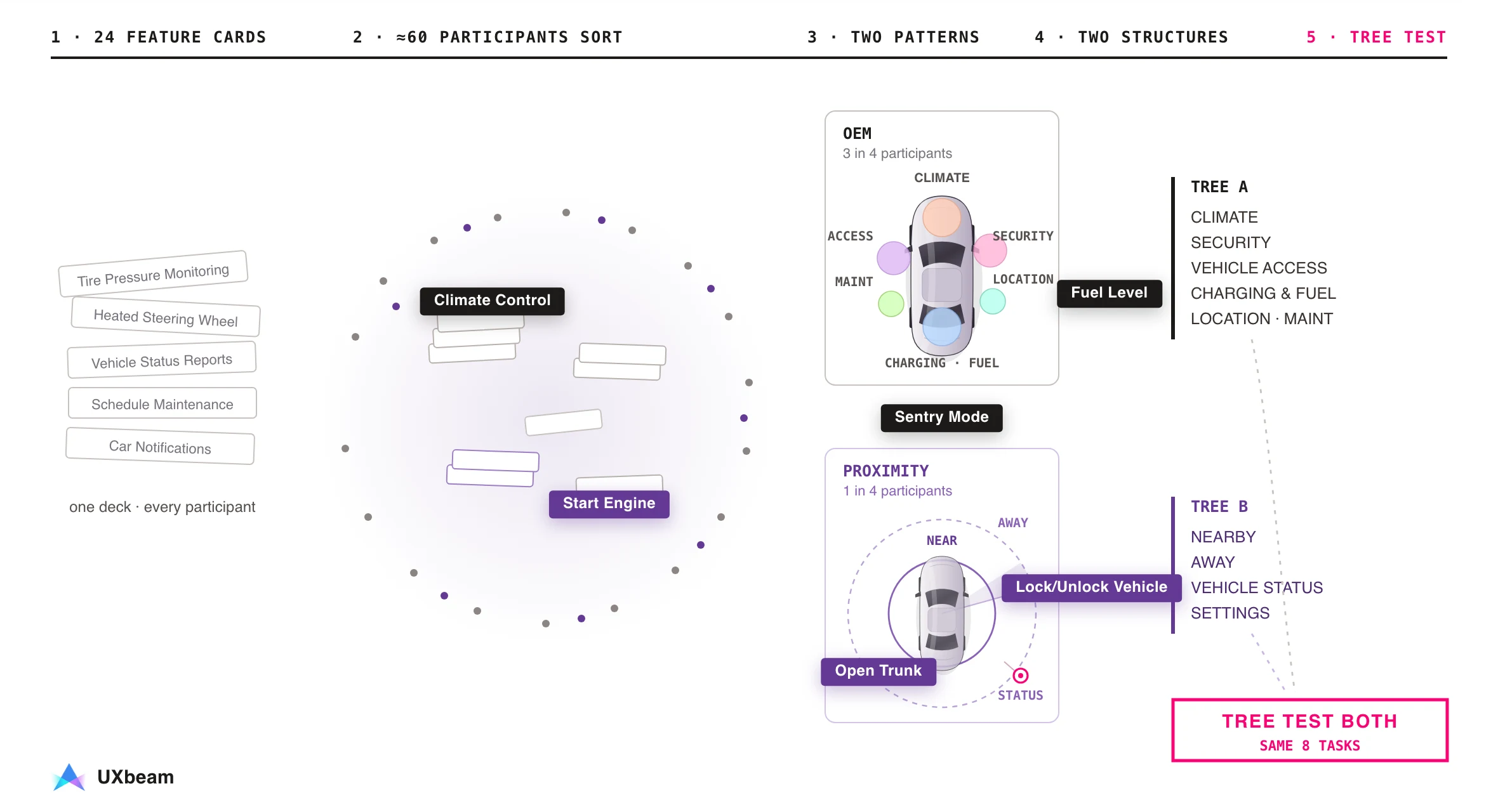
Participants created and named their own categories. Among the companion apps we audited, none used proximity or the user's relationship to the vehicle as the primary navigation structure.
The tree test: same eight tasks, separate groups
We tested both structures with the same eight tasks, using separate participant groups. Before participant testing, the final versions were cleaned up to remove duplicate destinations and obvious wording cues.
Each group had 18 participants in the clean set, drawn from the same US panel. Participants saw labels and hierarchy only, one task at a time. The eight tasks, verbatim:
- You're in the parking lot and want to start your car remotely before you get to it.
- You want the cabin temperature set to 72°F before you get in.
- Your hands are full. You need to get into the boot without putting anything down.
- You're leaving your car overnight in an unfamiliar area. You want to turn on the security monitoring.
- You're at home and realize you may have left your car unlocked at the station.
- You have a meeting at 9am tomorrow 12 miles away. You want the car ready and warm when you leave at 8:30.
- You parked somewhere unfamiliar two hours ago and can't remember exactly where.
- You're about to leave on a long drive and want to check your fuel level.
Overall: 70.1% task success for proximity, 60.4% for the convention
Across 144 attempts per structure, the proximity tree reached 70.1% task success (101 of 144) versus 60.4% (87 of 144) for OEM-style. Direct success, reaching the destination without backtracking, was 43.8% (63 of 144) in both. Proximity therefore helped more participants eventually reach a correct destination, but it did not reduce backtracking overall.
18 participants per structure · 8 tasks each. Share of attempts reaching a correct destination. Direct success was 43.8% in both structures.
The overall scores conceal large differences between individual tasks.
Where each structure wins and loses
Percent of attempts reaching a correct destination, per task. Readings summarize the paths participants took.
Situational tasks tended to favor proximity. Security monitoring from afar reached 83% success with the proximity structure versus 33% with the OEM-style structure, and checking range before a long drive reached 94% versus 50%. Tasks that match a familiar label favored the OEM-style structure: finding a parked car under Location reached 83% versus 61%. Neither structure gave participants a clear place for scheduled departure.
Card sorting opened a second design direction
The card sort revealed a radically different structure. Tree testing showed it outperformed the conventional IA on key tasks. It raised success on situational tasks like security monitoring and range checks, and it lost ground where the convention's labels are strong, like finding a parked car. A pattern from roughly a quarter of card sort participants was enough to produce a testable information architecture, and the tree test did the judging.
Reading multiple mental models
Two tested structures, plus an industry example
Mercedes-Benz has tested a third approach inside the vehicle. MBUX Zero Layer brings contextually relevant functions to the top level instead of requiring drivers to find them through fixed submenus. Zero Layer changes what the in-car screen shows; the UXbeam proximity structure changes how a companion app groups actions. Among the companion apps we audited, none uses proximity or the driver's relationship to the vehicle as the primary navigation structure.
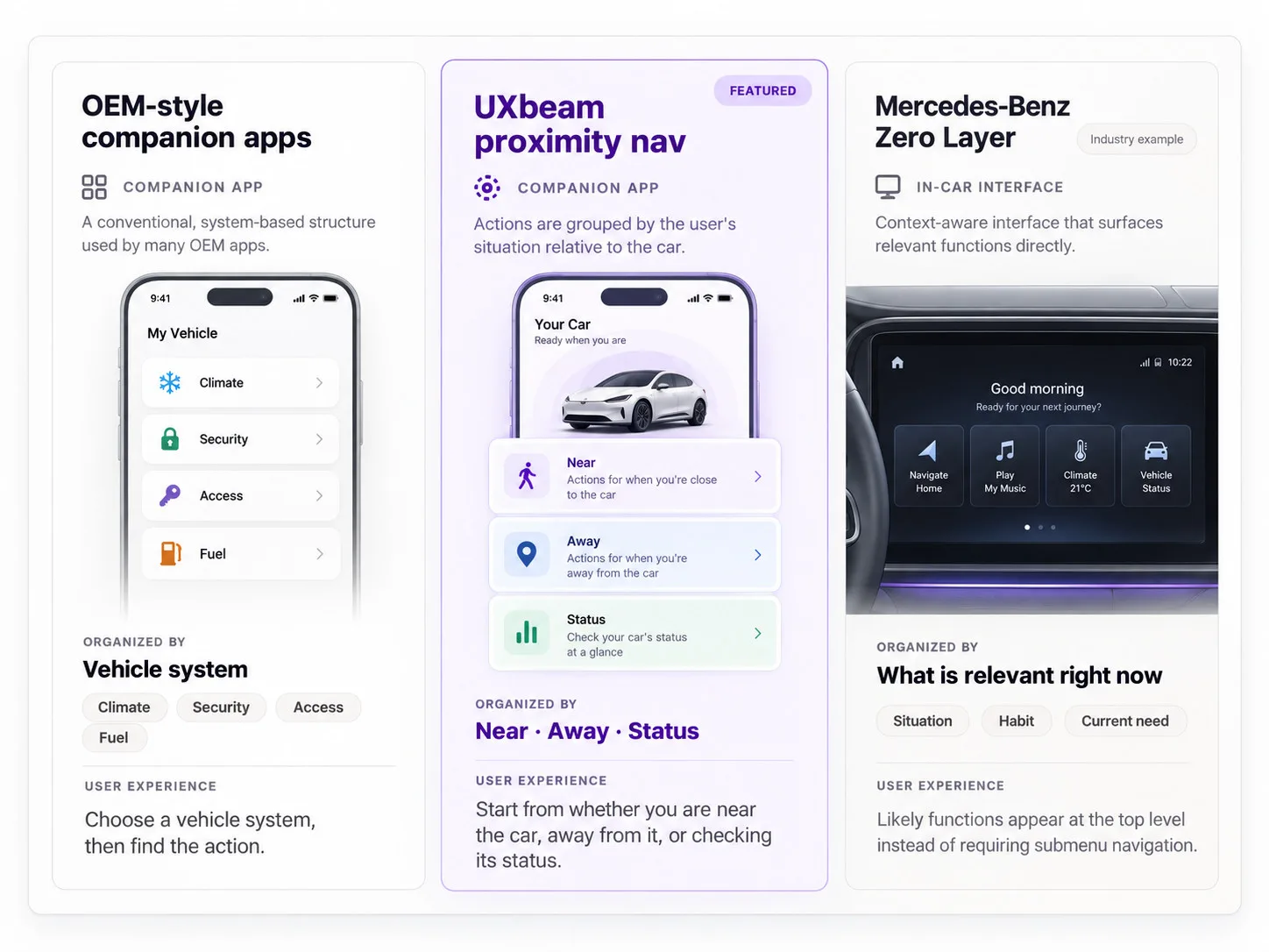
Tested here: the two companion-app structures. Industry example: Mercedes-Benz MBUX Zero Layer, a case of a similar IA restructuring. Illustrative reconstructions, not product screenshots.
See Zero Layer in motion
A short demo showcases how Mercedes-Benz MBUX Zero Layer surfaces relevant actions directly in the current interface instead of requiring submenu navigation.
For the next design stage, see moving from a sitemap to low-fidelity wireframes.
Method note
- Open card sort: run in UXbeam. The deck grew from 24 to 26 cards during fieldwork. Analysis snapshot at about 60 participants; recruitment later continued to 133.
- Participants in both studies were US-based adults recruited through online panels, deliberately not restricted to current connected-car app owners. The research question is whether participants can find common vehicle interactions under a given structure, so general-population findability is the right measure.
- A third, smaller mental model pointed toward a non-navigational concept and was explored separately; it is not part of this tree test comparison.
- Tree tests: the OEM-style tree (A, version 2, with decoy destinations) fielded April 12 to 19, 2026; the proximity tree (B, version 3) April 7 to 11, 2026. Task order randomized; leading terms audited before launch.
- Clean analysis set: 18 participants per structure after excluding internal/test sessions, one outlier session, and one participant exposed to both trees.
- Rates are observed percentages of completed attempts (144 per structure). Per-task gaps of a few points are noise; the large gaps (T4, T7, T8) are the interpretable ones.
- The two structures were tested with identical task order logic and the same eight task instructions.
Sources
- J.D. Power, 2025 U.S. OEM ICE App Report.
Nearly 80% of owners use their vehicle's app; 27% use it frequently. - Mercedes-Benz Group, MBUX Hyperscreen and the zero layer.
Context surfaces relevant functions without submenu navigation. - Mercedes-Benz USA, "EQS with unique MBUX Hyperscreen", 2021.
Zero layer debut with the EQS. - Mercedes-Benz press release via Automotive World, "MBUX Zero Layer now also available for C- and S-Class", February 2023.
Over-the-air expansion of the zero layer. - BMW Group, "New BMW Panoramic iDrive", January 2025.
Panoramic iDrive and Operating System X at CES. - KeyConnect, KeyConnect Digital Car Key.
Third-party digital-key app spanning 40+ makes.
Study data: UXbeam card sorting and tree testing sessions shown on this page.