Tree Testing vs Card Sorting: Choose or Combine?
By UXbeam · Updated October 29, 2026
Card sorting helps you discover how people group and name content. Tree testing shows whether people can find what they need in a navigation structure. Use card sorting when the categories themselves are in question. Use tree testing when you have a hierarchy and want to see how people navigate it.
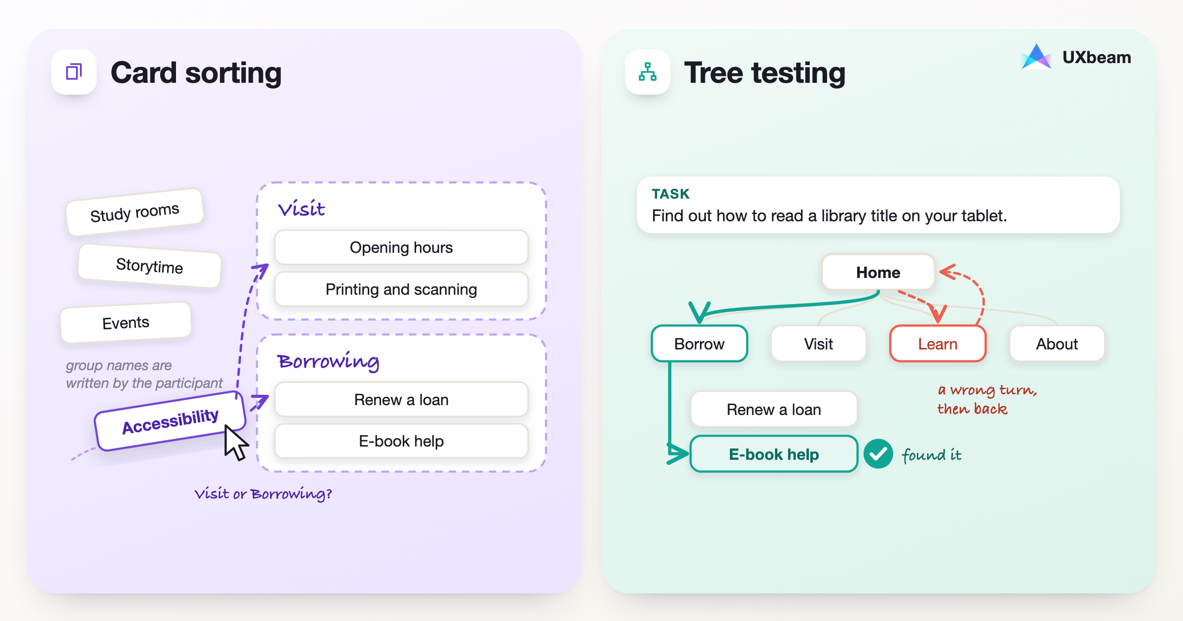
Card sorting
Participants group content cards and name the groups.
- Which cards belong together
- The names people choose
- Where they disagree
Tree testing
Participants look for one thing in a text-only menu.
- Where they click first
- Wrong turns and backtracking
- Where they finish
When the categories are still unsettled, card sorting can help develop a structure to test. If navigation already exists, a tree test can expose difficult routes before the team revisits its labels or groupings. Competing candidate structures can also be tested against equivalent tasks, particularly when a card sort has revealed more than one plausible way to organize the content.
The nine projects below show five ways of combining the methods. They range from a government website that changed one troublesome category name to a connected-car study in which two coherent organizing principles led participants down notably different paths.
Card sorting vs tree testing at a glance
| Card sorting | Tree testing | |
|---|---|---|
| Question | How would people group these items, and what would they call the groups? | Where would people go to complete this task in this hierarchy? |
| What participants do | Arrange cards into groups, with categories they create or categories you provide. | Navigate a text-only tree to choose a destination for a realistic task. |
| What you learn | Grouping patterns, category expectations, labels, disagreements and possible organizing principles. | First choices, paths, backtracking, final destinations and task outcomes. |
| Useful starting point | Categories are unsettled or several organizing ideas are plausible. | A current or proposed hierarchy is ready to evaluate. |
| What you produce next | Candidate categories or structures to develop and test. | Specific navigation decisions: revise labels, move content, compare alternatives or investigate a difficult task. |
An open card sort lets participants create and name categories. In a closed card sort, you supply the categories and participants place items within them. A hybrid sort provides categories while allowing people to add their own. Tree testing takes the next question into a hierarchy: can people find the destination while navigating one level at a time?
What each method shows you
A card sort can run with index cards in a room or online. Moderated sessions let you hear why a participant put a card in one group and where they hesitated; unmoderated sorts can involve larger samples. A tree test removes the interface and leaves the navigation labels. It can reveal destinations that exist in the hierarchy but are difficult to find, and the paths show which labels send participants elsewhere.
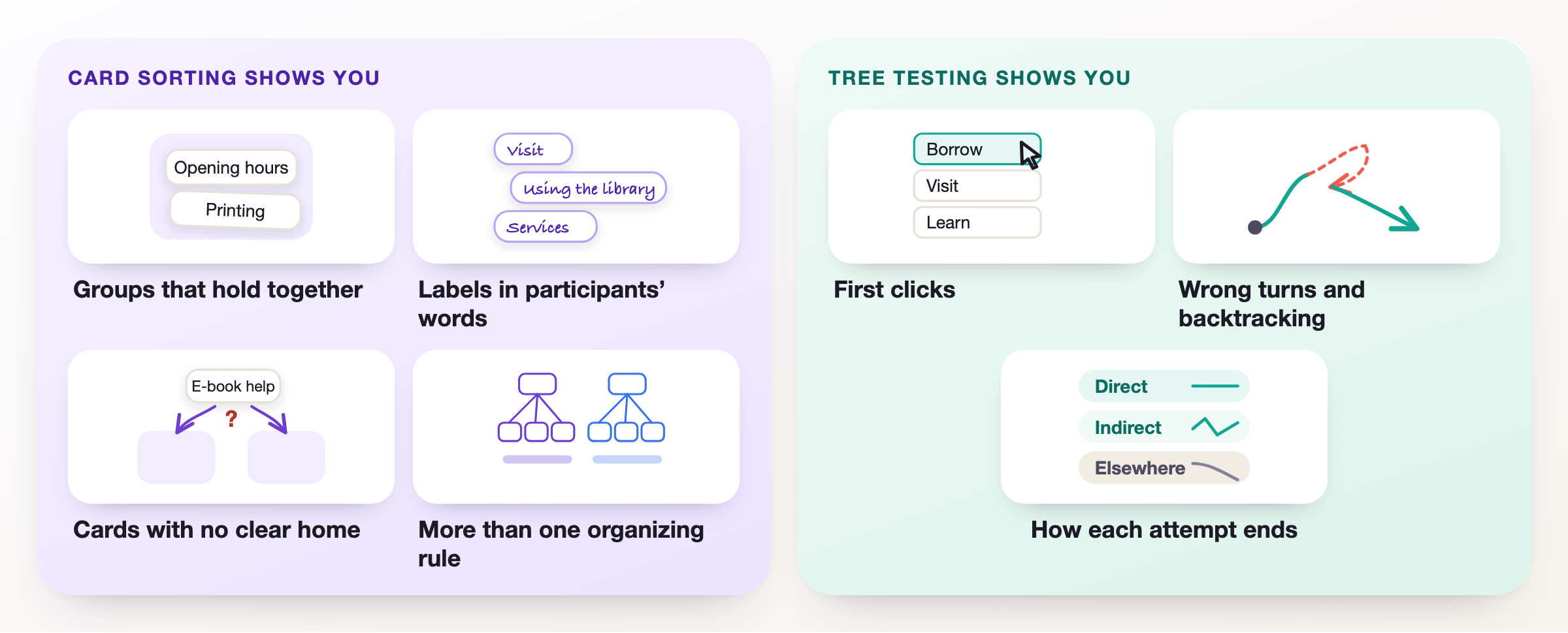
Card sorting shows you
Groups that hold together
Cards most participants put in the same group are the core of a likely section.
Labels in participants' words
The names people write are label candidates; the most common one is a strong starting point.
Cards with no clear home
A card split between groups is a placement to decide, and a good task for a tree test.
More than one organizing rule
Some people group by topic, others by the task they came to do. UXbeam's Mental Model Detection reports such patterns separately instead of averaging them into one structure.
Hands to tree testing: a candidate structure still carries decisions the sort could not settle, such as where the contested cards go and what each menu is called.
Tree testing shows you
First clicks
The top-level label people choose first shows which names draw them in.
Wrong turns and backtracking
Backtracking shows where participants reconsidered a branch; their full paths help explain what drew them there.
How each attempt ends
Direct reached the destination without backtracking, indirect reached it after backtracking, elsewhere finished somewhere else.
Hands back to card sorting: when first clicks keep splitting between two branches, how people group that content is the next question to investigate.
Five ways to combine card sorting and tree testing
The projects below use different research sequences because the teams faced different decisions. Some developed a navigation from card-sort findings; others tested a structure that already existed, then returned to the categories or labels that caused difficulty.
1. Discover a new navigation: Open card sort → Candidate structure → Tree test
Use this when: You are building a site or feature area and need a first navigation that reflects how people understand its content.
An open sort gives the team evidence about the groups participants form and the names they use. Those results can inform a draft hierarchy, which a tree test can then evaluate using tasks people need to complete. In UXbeam, a selected grouping can be opened directly as an editable sitemap; the categories and items remain available for the researcher to adjust before sending the structure to tree testing.
1Residents sort the content
An open card sort; residents name their own groups.
2A draft Yukon.ca
The 16 proposed categories become the top-level navigation.
3Tree test, 12 tasks
One label caused uncertainty and was renamed.
Government of Yukon: improving a proposed category before launch. During the creation of Yukon.ca, residents organized content in an open card sort that produced 16 proposed categories. Another group navigated the draft site through 12 tree-test tasks. Most of the structure held up, but Transportation caused uncertainty, so the team renamed it Driving and transportation. They could retain the broader organization and address the particular label that the navigation test had exposed. 1
2. Test the categories, then the routes: Open card sort → Closed card sort → Tree test
Use this when: An open sort suggests categories, but important content placements still need checking.
An open sort may reveal category names that sound promising without settling where every piece of content belongs. A closed sort can examine those contested placements using categories the team supplies. Tree testing follows with a different kind of evidence: the route a participant takes when trying to find the content in the proposed hierarchy.
1Card sorts suggest categories
Open and closed sorts shaped the main categories; some placements stayed contested.
2Tree test in one prototype
The same ten tasks in three different orders, with 11 participants in total.
3Proposed categories after testing
The proposed structure gives Valuation & Pricing its own category within Guidance & References.
Card titles and structure from ONRR's published “Categories after testing” table 2; the placement cards in step 1 are illustrative.
US Office of Natural Resources Revenue: make decisions about actual content. During a federal website redesign, ONRR combined a content audit, open and closed card sorting, and tree testing of proposed navigation. The team proposed moving Reporting Resources into the corresponding reporting sections, giving Valuation and Pricing its own category within a new Guidance and References section, and cross-listing Indian pricing, regulations and codes under Indian Resources. These changes would alter both the navigation categories and the routes to specific resources. 23
Welcome to the Jungle: discover where your company structure leaks into the menu. The B2B product team first sorted features internally, then ran closed and open sorts with users before tree testing the proposed navigation. Participants struggled to distinguish ATS from Jobs, labels that reflected internal team boundaries. Their groupings pointed toward Recruitment as a clearer home for job-related features. The revised hierarchy could use a name that made sense to customers rather than preserving the distinctions between the company's internal teams. 4
3. Compare competing organizing ideas: Card sort → Two candidate trees → Tree tests
Use this when: Participants reveal more than one coherent way to organize the same content, or the team has several credible navigation ideas.
A card sort can reveal two coherent ways of organizing the same content. Either may make sense when you examine the categories, but the differences become easier to judge when participants try to complete the same tasks in each proposed hierarchy. UXbeam's Mental Model Detection reports distinct grouping patterns separately, including their category names and differently placed cards. A researcher can explore either as an editable sitemap before testing the candidate navigation.
UXbeam connected-car study: the alternative hiding in the card sort
Five vehicle companion apps we audited organized features by vehicle system: climate, security, access, charging and location. An open sort of connected-car features surfaced another idea: organizing actions around proximity to the car, such as things you do Nearby or Away. In one analysis snapshot, about a quarter of participants grouped features around that principle rather than the vehicle systems.
How the research developed
- 1Feature auditFive manufacturer apps, 24 features, organized by vehicle system
- 2Early card-sort findingsGrouping by vehicle system and by proximity both appeared
- 3Two candidate treesOne structure for each principle, developed from those early findings
- Climate
- Security
- Vehicle access
- Charging & fuel
- Location
- Maintenance
- Nearby
- Away
- Vehicle status
- Settings
UXbeam examined a proximity-oriented navigation alongside a conventional system-based structure. Each was tree-tested with 18 participants. For the same task of checking from home whether a car had been left unlocked, 11 of 18 participants went directly to the destination in the proximity tree, versus 3 of 18 in the conventional tree. On the parked-car task, 15 of 18 participants reached the correct destination in the conventional tree, compared with 11 of 18 in the proximity tree. Scheduled departure caused difficulty in both.
Two tasks, worded identically in both trees
Direct success
Checking from home whether the car was left unlocked
One dot per participant
Overall success was close: 12 of 18 in the proximity tree, 13 of 18 in the conventional tree.
Task success
Finding the parked car
One dot per participant
Explore UXbeam's connected-car card sort and tree-testing study.
A financial-services content hub: let the research challenge the team's favorite
A large financial firm had 125 pieces of content and several preferred navigation ideas, including category names designed to sound clever. Researcher John Nicholson developed a representative 75-card deck, piloted and refined its wording, and had 55 people sort it. The findings informed two new information architectures, which were tree-tested alongside an adapted version of the original.
In successive rounds, 540 participants tested the three candidates and 360 more tested refinements to the strongest two. Nicholson reported that the selected structure achieved 75% higher findability than the original. The research challenged labels the team initially favored, then used findability results rather than internal preference to select the structure. 5
1Open card sort
Participants grouped the pages; nearly everyone used Visit.
2Two options, tested separately
The invitation list was split between the two tree tests.
3Combined menu
The strongest parts of both options.
Harvard Library: combine strengths rather than declare one tree the winner. Harvard's web team used open card sorting to develop two navigation options and tree-tested them with students. Participants repeatedly chose Visit as a category label and preferred grouping How Tos alongside related content instead of presenting them as one long list. The final navigation brought together the useful parts of both tested menus, including Help With, Visit, Explore Collections and About Us. 6
A researcher following this sequence in UXbeam Card Sorting can inspect the distinct mental models, open a selected grouping as an editable sitemap, and send the saved structure into UXbeam Tree Testing. The candidate retains the researcher's edits to its labels, groups and item placements; tree-testing results then show how participants navigate that choice.
4. Improve an existing navigation: Baseline tree test → Card sort → Retest revised structure
Use this when: The existing site has recurring wrong turns, buried destinations or categories that no longer accommodate the content.
One useful sequence for an existing website is to tree-test the current navigation as a baseline, use a card sort to investigate its grouping or label problems, then tree-test a revised structure using comparable tasks. UXbeam shows first clicks, complete paths and final destinations at task level, so the results can be interpreted alongside the routes participants took. The govt.nz study below used a related order: it began with card sorting, compared the existing tree with proposed alternatives, then refined and retested them.
govt.nz: test the existing site and refine the alternatives
1Card sort
122 participants grouped 43 topics.
2Round 1: three trees
Vague headings, brand names and “services” drew wrong clicks.
3Round 2: revised trees
The revised proposed structure was recommended over the minimal tree.
Overall task success per tree, from the 2012 report 7. Each round was a separate test, so compare trees within a round.
In research for New Zealand's govt.nz site, 122 people sorted 43 topics and grouped them overwhelmingly by topic. The first round of tree tests compared the existing site with two candidate structures: an initial proposed structure developed just before the study, which covered most government content, and an exhaustive tree covering every topic. The report recorded 62% overall task success for the existing structure, 79% for the initial proposed structure and 71% for the exhaustive tree.
The paths showed where language mattered. Vague headings such as “About New Zealand”, brand names without an explanation and the word “services” drew people away from their goals. In the second round, the revised proposed structure again recorded 79%, against 73% for a minimal tree limited to the most common content. Participants found most items as easily in the larger structure, and the researchers recommended the revised proposed structure because it is more likely to accommodate new content as it is added. 7
RetailMeNot: put account features where people expect them. RetailMeNot combined card sorting of member information with tree testing of its existing navigation and several rounds of revision. Twelve of twenty sort participants placed stored payment cards in Wallet, while tests revealed difficulty finding email preferences deep under Account → Security → Preferences. The team moved preferences directly under Account and continued testing the proposed navigation. The placement preference and the observed difficulty with the existing path pointed to the same revision. 8
5. Organize a large content inventory: Inventory → Card sort and content mapping → Tree testing
Use this when: A redesign or migration involves far more pages than you would reasonably hand to one participant to sort.
A content inventory establishes what must be accounted for. The team can sort a representative selection to investigate category names and grouping principles, then use content analysis and structured review to place the remaining pages. The proposed hierarchy becomes something to test through important user tasks, while the inventory remains the record of where every page is intended to go.
1185 page labels
More than one participant can sort; the agency keeps participant sorts to about 40 cards.
2Designers synthesise
An internal team sort produced two candidate structures.
3Participants test
Each user group tree-tested the candidates.
Barnardo's: bring 185 page labels into a navigable structure. For a charity website redesign, Bit Zesty's designers worked with 185 page labels. Rather than ask participants to sort all 185, three designers independently organized the complete inventory using earlier research, then consolidated their ideas into two candidate structures: a broad, shallow hierarchy and a deeper audience-based alternative. Participants tree-tested both approaches. The broad, shallow structure was easier to navigate, and the team refined it with useful ideas from the other candidate. Here the sorting was team synthesis, while the tree test supplied participant evidence about the proposed routes. 9
The inventory and candidate sitemap have different jobs here. The inventory accounts for the complete body of content; the sorting and synthesis inform the navigation; tree testing checks whether people can reach consequential destinations. In UXbeam, researchers can open a selected card-sort grouping as an editable sitemap, add pages that were outside the original sort and tree-test the resulting hierarchy. These are researcher-directed edits, with the placement of remaining pages still a content decision.
Which method comes first?
- No agreed categories? Start with an open card sort, then build and tree-test a candidate hierarchy.
- Categories exist, but placements are disputed? Use a closed or hybrid sort for the disputed content, then tree-test important destinations.
- An existing navigation is underperforming? Tree-test a baseline first. Sort the content if the findings point toward a grouping or label problem, then test a revision.
- Two plausible structures? Use tree testing to compare them through equivalent user goals and accepted destinations.
- A very large website? Start with an inventory, sample strategically, and combine sorting, content decisions and navigation testing.
The starting point is the decision still open and the evidence the team already has.
How to read the results together
A card-sort result gives you grouping evidence: cards frequently placed together, labels participants wrote, ambiguous items and potentially different organizing principles. It helps you draft candidate navigation.
A tree-test result shows what happened when participants tried to reach a goal through that navigation: the first category they chose, the path they followed, whether they went back and where they finished. Two structures can produce similar overall success scores while sending participants down different routes. UXbeam shows those paths and identifies recognizable first-click patterns at the task level, such as one wrong opening choice attracting most participants or two competing first choices splitting the responses.
For a meaningful comparison, use equivalent task wording and scoring across the candidate structures. In the connected-car study, the task of checking from home whether the car had been left unlocked was worded identically for both trees; the direct-route difference therefore provides a cleaner comparison for that task than an overall result that also includes differently worded tasks.
For the step-by-step workflow, see Card Sorting → Sitemap → Tree Testing. For interpreting the figures, see Key Metrics in Card Sorting and Tree Testing. For task wording and study setup, see How to Run a Tree Test.
From card sort to tree test in UXbeam
In UXbeam the two studies share one structure. The groupings participants make become a sitemap you can edit, and the saved sitemap becomes the tree participants navigate, so nothing is retyped between studies and each result can be traced to the version it tested.
-
1Participants sort the cards
Each participant drags the items into groups and names them, or uses the categories you provide in a closed sort.
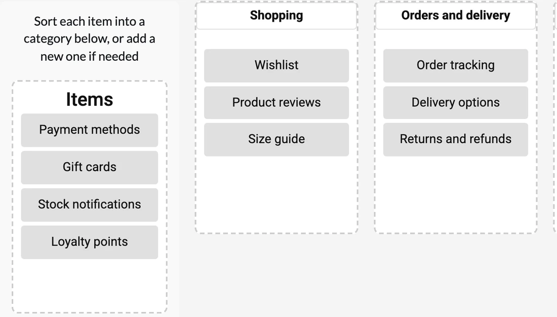
Screenshot of a UXbeam card sort, participant view. -
2Read the groupings and the names
Drag the similarity threshold to form groups, check the similarity matrix for the pairs participants split on, and see the category names they wrote. Where participants organize the content in more than one coherent way, Mental Model Detection reports each pattern separately.
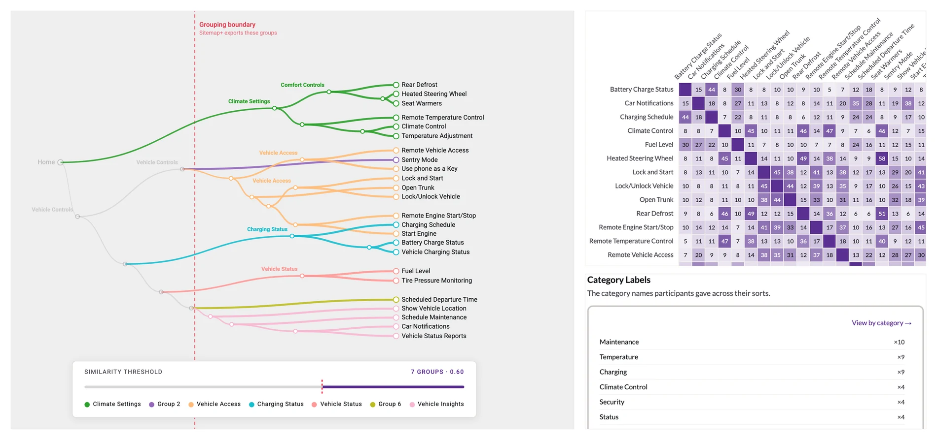
Screenshot of UXbeam card sort results from the connected-car study. -
3Open a grouping as an editable sitemap
The groups arrive as a tree. Rename, move, add or delete items until it is the structure you want to test, then save it as a version.
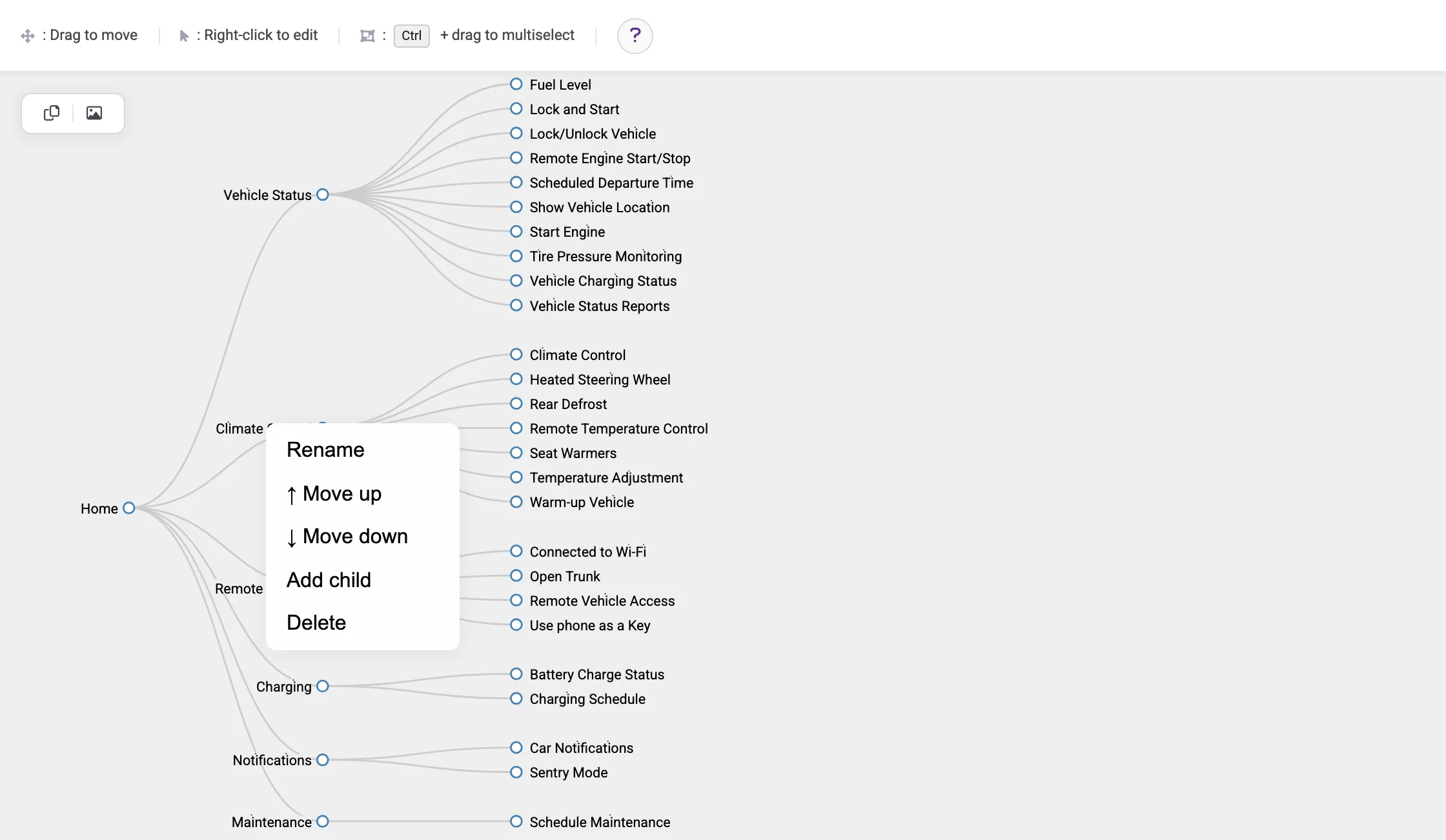
Screenshot of the UXbeam sitemap editor. -
4Participants look for things in the tree
Send the saved sitemap to a tree test. Participants see the labels only, one level at a time, and each attempt is scored direct, indirect or elsewhere.
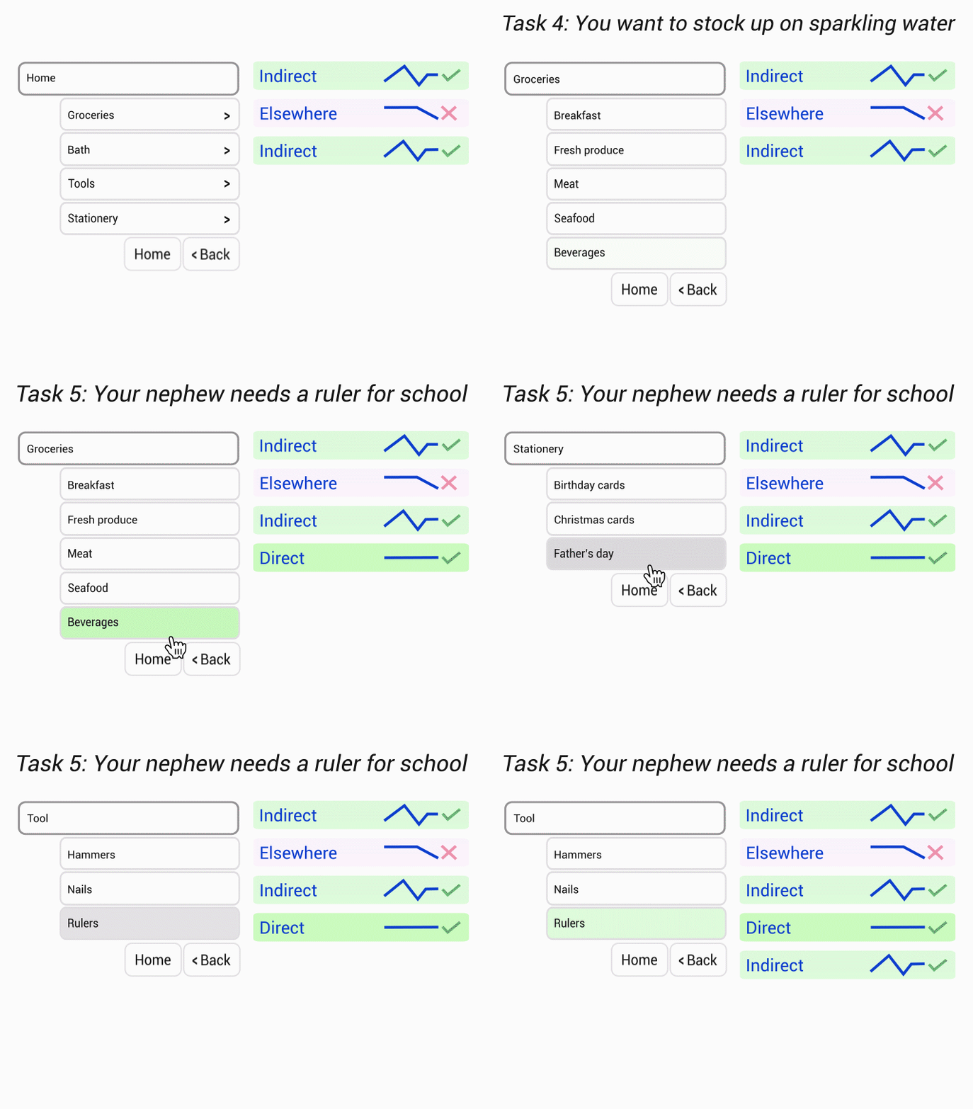
Animated illustration of tree-test attempts and their outcomes. -
5Read first clicks, paths and destinations
Each task shows its success, its direct share, the most common first clicks and where participants finished; the paths view shows which branches drew the traffic. Change the tree, test again, and compare the versions.
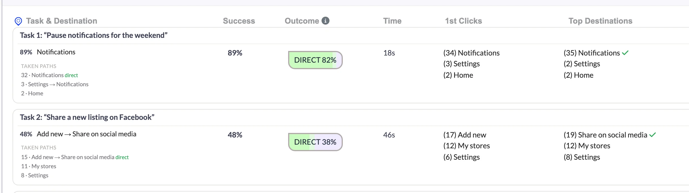
Screenshot of tree test task results. 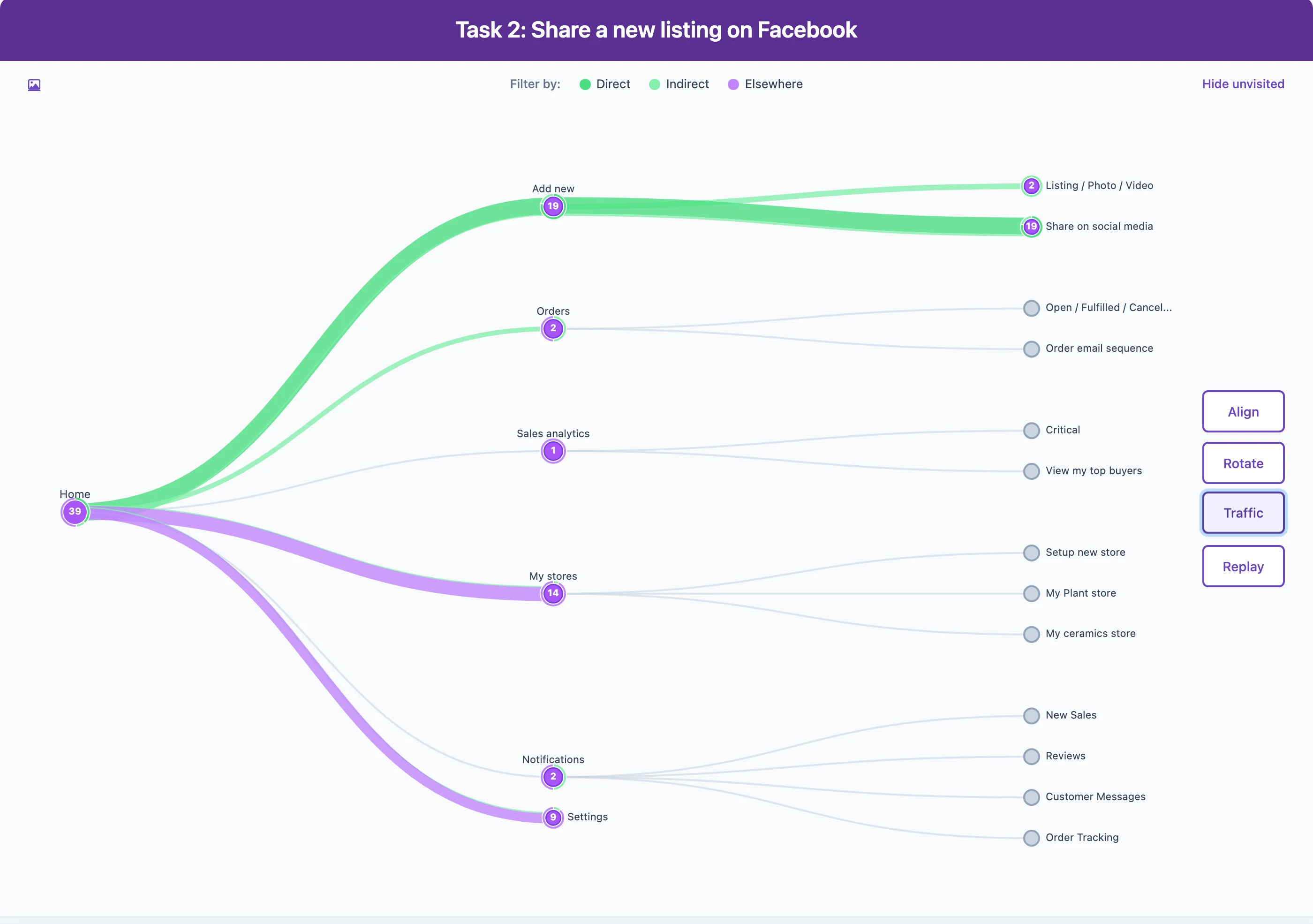
Screenshot of the paths Traffic view.
Watch the whole workflow
Original UXbeam workflow demonstration · 2023. Open on YouTube.
Frequently asked questions
Is card sorting better than tree testing?
They answer different questions. Card sorting helps discover or examine content groupings and category names. Tree testing evaluates whether participants can navigate a particular hierarchy to reach important destinations. Choose by the problem you need to solve.
Can I run tree testing before card sorting?
Yes. For an existing website, a baseline tree test can reveal where people choose the wrong category or lose their way. You can then investigate those areas with card sorting and test a revised structure.
Should I do open card sorting, closed card sorting or both?
An open sort is useful when participants should create the categories. A closed sort investigates placement among categories you've supplied. You can use both when you first want to discover grouping ideas and then examine how selected content fits the proposed categories.
Can card sorting tell me whether a navigation will be easy to use?
Card sorting reveals how participants organize the items they can see. Tree testing adds the findability evidence: it shows how participants move through the proposed hierarchy to locate destinations.
References and case studies
- Government of Yukon. “Putting your categories to the test.” Yukon.ca digital blog, 2017.
- Office of Natural Resources Revenue. “Tree testing using a clickable prototype.” ONRR blog, 2020.
- Office of Natural Resources Revenue. “The research behind ONRR's website modernization.” ONRR blog.
- Welcome to the Jungle. “Redesigning navigation with a user-centric approach.” WTTJ Tech, 2024.
- Nicholson, J. “How a card sort helped a top financial firm create an intuitive IA.” UX Collective, 2022.
- Deschenes, A. “Making our navigation useful and usable.” Harvard Library, 2018.
- Optimal Usability. “govt.nz information architecture research report.” Department of Internal Affairs, New Zealand, 2012 (PDF).
- English, B. “Better navigation design through user research.” RetailMeNot Product, 2019.
- Paplauskaite, L. “Information architecture redesign, part 2 of 3: how to make sense of hundreds of pages (card sorting).” Bit Zesty, 2017.